There was a bit of a trick in that exercise, in that 4 packets of crisps may have seemed like the maximum, because it gave a higher total utility than 5 or 6 packets, but it turned out to be only a local maximum. This is entirely due to the fact that the number of packs of crisps I have to buy has to be an integer. If we allowed fractional purchases, then there would be just one maximum. This would a silly assumption to make, and as it turns out it does not really matter if we do not make it: we will see later that when considering demand curves for a large number of consumers, these discontinuities are of negligible significance.
I've repeated the exercise multiple times, with different prices for nachos, to find the optimal number of packs of nachos to buy. Where two different choices give exactly the same maximum utility, I've used the average. The resulting numbers have been turned into this graph by the Excel graph wizard.
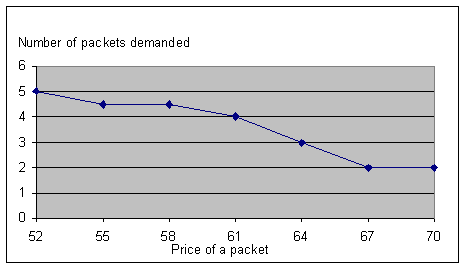
Since this graph relates the price of a good to the quantity demanded, it counts as a demand curve, albeit for one particular consumer.