Understanding Linear Regression with Graphs
Introduction
Teaching 'multiple linear regression’ (or just, MLR) involves more than showing students how to estimate a model. It also requires helping them understand how the method separates a relationship of interest from other influences, what it means to hold those influences constant, and why this distinction matters when moving from association to causal interpretation.(note 1) When suitable data are available, multiple linear regression provides a framework for doing this. Usually estimated using 'ordinary least squares’ (or just, OLS), it enables us to estimate conditional, “all else equal” relationships; i.e. how one factor is related to an outcome while other relevant factors are held constant. The challenge for students is to understand how MLR achieves this separation and to recognise the conditions under which the resulting relationship can be interpreted causally.
Econometrics textbooks address these questions, but often in a way that leans heavily on mathematics (see Greene, 2017; Stock and Watson, 2019; Wooldridge, 2020). Although the maths itself is not especially advanced – mainly linear algebra and introductory calculus – many students find the abstract expressions hard to connect with real-world intuition. The result is that some disengage early, labelling the subject as “too mathematical” and struggle later when the focus turns to practical, applied examples. Others follow the technical content but miss the critical understanding of what the models are really doing.
In what follows, I set aside the algebra and instead use a visual approach, which I believe is more intuitive. As I do for my own teaching, I will begin with theoretical predictions, then move to real-world data, starting with simple linear regression and building up to the MLR model. The emphasis will be on graphical representations – in both two and three dimensions – to illustrate how the method works. My experience in teaching is that this approach not only makes the ideas more accessible across disciplines but also encourages a deeper, more critical grasp of the logic. Once this foundation is in place, the more advanced technical material becomes far easier to follow.
Simple Linear Regression – Handle with care!
Let’s begin with the most basic approach: simple linear regression. This method can give us a first impression of the relationship between two variables. But we must be cautious. What looks like a strong link in the data does not necessarily mean one factor causes the other.
To make this concrete, suppose we want to examine the relationship between education and crime in a given county (a common geographical administrative area in both the UK and the US). Suppose education is measured as ‘the percentage of adults with tertiary education’, and crime as ‘the number of reported crime incidents per 1,000 residents’, both at the county level. Our question then becomes: what happens to crime rates if education levels rise – perhaps due to a new policy encouraging more students to stay in school – while all other conditions in the county remain the same? Let's use some real-world data from Florida, USA, obtained from Agresti et al., 2021. Here we observe both crime rates and education levels, as defined earlier, for all Florida counties – 67 of them.
But before looking at the data, it is helpful to consider what theory would predict. Economics offers one perspective: more education usually means better jobs and higher incomes, so people have more to lose by committing crime (Freeman, 1999). Sociology provides another: according to social cohesion theory, for example, educated communities are often more connected, with higher levels of trust and cooperation, which tends to reduce crime (Kantzara, 2011). Although these are simplified accounts, they point in the same direction – we would expect education and crime to move in opposite ways.
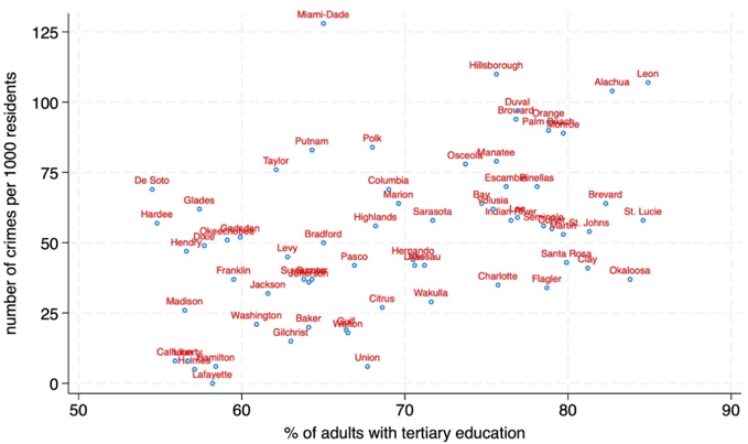
But do the data agree? Figure 1 shows a scatterplot of crime against education across Florida counties. Surprisingly, the pattern appears positive: counties with more educated adults also tend to have higher crime rates.
Figure 1: Scatterplot of Crime rates vs Education rates
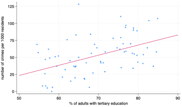
Using simple linear regression, we can fit a line through these points to summarise the pattern. The line, known as the regression line, is chosen so that it gets as close as possible, on average, to all the points – this is the principle behind the OLS method.(note 2) As shown in Figure 2, this regression line slopes upward, and suggests that each additional percentage point of adults with higher education is associated with about 1.5 more crimes per 1,000 residents.(note 3)
Figure 2: The OLS line
While a few students are puzzled by the positive trend, most are not persuaded that higher education really causes higher crime. What we have so far is only an association between county characteristics. Because the data are measured at county level, they do not show how changing one individual’s education would affect that individual’s behaviour. We do not actually see how crime changes as education increases within a county, and it is difficult to imagine a situation where raising education rates would, all else equal (ceteris paribus), lead to more crime.
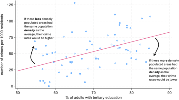
A more convincing explanation is that another factor influences both education and crime at the same time. Such factors are often called confounding variables, and they are a common challenge whenever we try to uncover genuine causal links. One obvious candidate here is population density. Metropolitan areas usually have more highly educated residents, but they also tend to experience higher crime rates. Figure 3 makes this visible: the larger the bubble, the higher the population density, and we see that the big bubbles cluster in the top-right corner. This pattern is consistent with the idea that density helps to explain the observed positive relationship. If we could “adjust” for density – that is, compare counties with similar population density but different education levels – the line showing the relationship would probably be flatter, or perhaps even slope downward, as suggested in Figure 4.
Figure 3: A bubble plot showing density
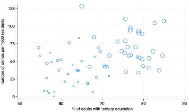
Figure 4: Adjusting for 'density'
From simple to multiple regression
But is there a way to “adjust” for the fact that population density differs across counties? This is where the Multiple Linear Regression (MLR) model comes to the rescue. As Stock and Watson (2019, p. 221) put it: “The key idea of multiple regression is that if we have data on these omitted variables, then we can include them as additional regressors and thereby estimate the causal effect of one regressor while holding constant the other variables”. Causal interpretation also requires that the relevant confounders have been appropriately accounted for. While econometrics textbooks go on to cover many advanced techniques, the MLR model is the natural starting point – and in fact, most modern methods build on it. Let’s now see how the MLR model works, and how it holds other factors constant, by looking at some additional graphs.
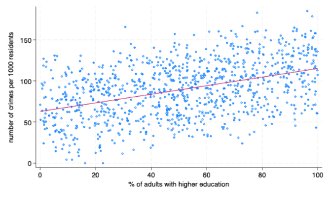
This time, we will use simulated data. I generated this dataset to mimic the patterns we saw in the Florida counties, but with many more observations. The advantage of simulation is that it allows us to illustrate the ideas much more clearly, without being limited by the smaller number of data points. After working through the simulated example, I will return to the Florida data to show you that the same conclusions hold there too. Figure 5 shows a scatterplot of the simulated data, along with the OLS line. Just as before, we see a clear positive association between education and crime.
Figure 5: Scatterplot and OLS line in simulated data
But now let’s turn to the MLR model, which simultaneously uses both education and density as factors explaining crime. In graphical terms, we add another axis, so the data can be displayed in three dimensions, as shown in Figure 6.
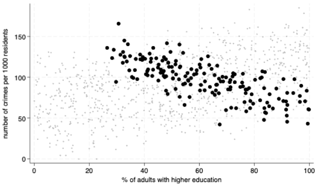
At first, you might wonder: how does this help? After all, even in this 3D graph, the overall relationship between crime and education still looks positive. But here is the key insight. When we rotate the graph to view it from a different angle (as in Figure 7), a new pattern emerges: for any given level of density, as education rises, crime actually falls. This becomes even clearer in Figures 8 and 9, where we zoom in on a single “slice” of density, but the same result holds for any other value of density. In other words, once we hold density constant at any particular level, the relationship between education and crime turns negative – exactly what theory suggested in the first place.
Figure 6: Introducing 'Density'
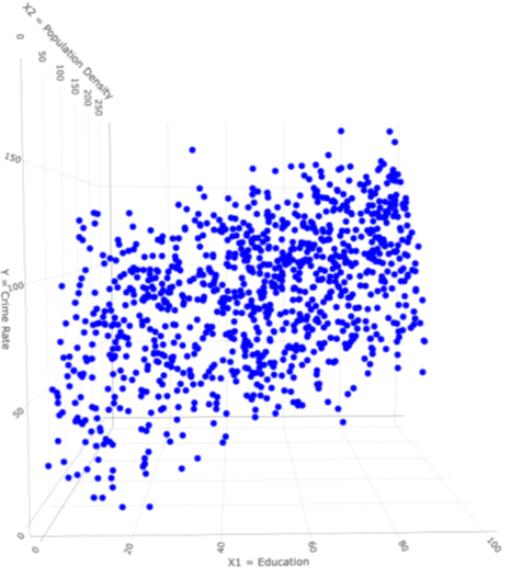
Figure 7: Rotating the 3D scatterplot
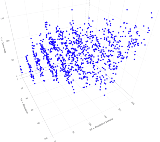
Figure 8: Holding Density fixed at 150 (in 3D)
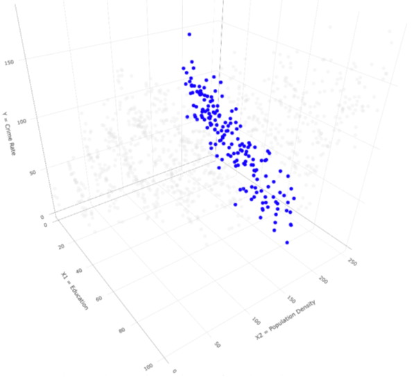
Figure 9: Holding Density fixed at 150 (in 2D)
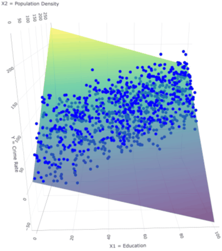
The idea of OLS in three dimensions is much the same as in two, but extended. Instead of fitting the “best line”, we now fit the “best plane”, taking into account both education and density at the same time. We are asking: what is the plane that best fits the data in the education direction while holding density fixed, and simultaneously best fits the data in the density direction while holding education fixed? Finding this plane requires some linear algebra, and although the details are more involved than in the two-dimensional case, matrix algebra provides an efficient way to do it.
The important point is this: the fitted plane must slope downward in the education direction (since more education is linked with less crime, once density is held constant) but upward in the density direction (since more density is linked with more crime for any education level). Instead, a plane that would slope upward in the education direction would not provide a good fit at all! This “best plane” is shown in Figures 10 and 11. Notice how clearly the negative slope appears in the education direction. The message is simple: the MLR model tells us that, for counties of the same population density, counties with higher education levels tend to have lower crime. The earlier simple linear regression, by ignoring density, gave us a highly misleading picture.
Figure 10: The OLS plane (in rotated 3D scatter)
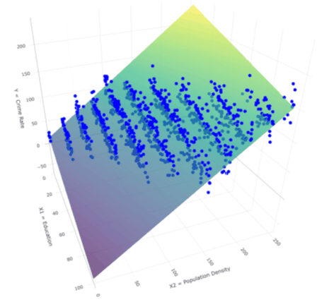
Figure 11: The OLS plane (in the non-rotated 3D scatter)
Back to the real-world data, and beyond
Let’s now turn back to the real-world data. Figure 12 shows the 3D scatterplot for the Florida data, with density added as a third axis. Because the dataset is relatively small, the scatterplot alone does not make the education–crime relationship at different levels of density as obvious as in the simulated example. However, if we zoom in on a narrow band of density – for instance, counties with density between 90 and 100, as in Figure 13 – a negative relationship emerges with more education being associated with lower crime.
Figure 12: 3D scatter with OLS plane using the Florida data
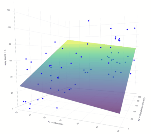
Figure 13: The Crime-Education relationship for density between 90 and 100 (in 2D)
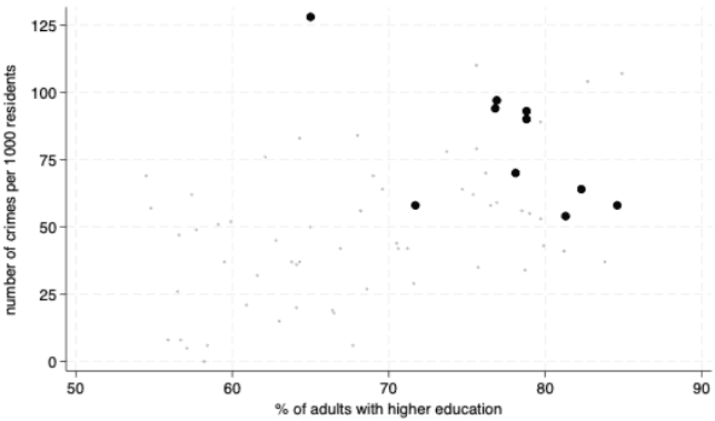
Overall, the fitted plane still slopes downward along the education axis, confirming that, holding density constant, counties with more education tend to have lower crime.(note 4)
What do these results show? According to the data, holding density constant, each additional percentage point of adults with higher education is associated with about 0.6 fewer crimes per 1,000 residents per year.(note 5) In a county of 100,000 residents, it corresponds to roughly 60 fewer crimes annually.
Of course, we need to be clear that this is only a conditional association; not necessarily the causal (ceteris paribus) effect of an education policy. The model is still highly simplified because adjusting for population density alone does not account for all relevant confounding factors. Poverty, for example, could influence both education and crime. Even among counties with similar population density, counties with higher poverty rates may have fewer adults with tertiary education and higher crime rates. If poverty is omitted from the model, part of its relationship with crime may therefore be incorrectly attributed to education. If suitable data are available, the solution is straightforward; to adjust for differences in poverty, we simply add our measurement of poverty to the model alongside density, leading to a model with 3 variables. Although we can no longer draw this in a graph, as we are limited by our 3D world, matrix algebra can easily handle cases with many variables at once. If poverty is added, then what we would measure is the education-crime relationship holding both density and poverty constant.
It is important to remember that what we have covered so far is just the tip of the iceberg. Once the core ideas are in place, many other interesting extensions can be added. Here I will mention two of them only briefly, since a full treatment would require much more time.
For example, up to now, we have assumed that the link between education and crime looks the same (i.e. same slope) at every level of density. But what if that is not the case? Imagine that in very rural areas the relationship is actually positive, then weakens as density rises, and eventually turns negative in large towns. Figure 14 illustrates this kind of situation using simulated data and generic variables X1, X2 and Y. To capture such a pattern in the data, the regression model needs to be expanded by adding what we call an interaction term (i.e. a product between the two variables X1 and X2). This then allows for the slope of the relationship between Y and X1 to change depending on the value of the other variable X2. In this case, the slope along the X1 axis flips from positive to negative as X2 increases. If we forced the model to fit just a constant slope, the fitted plane would not match the data and would give us the wrong picture.
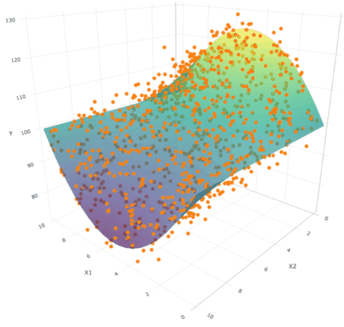
Regression can capture all sorts of non-linear relationships too, such as curved relationships. Figure 15 gives an example where the link between X1 and Y is not a straight line at all, but instead, it is quadratic: U-shaped when X2 is low, but inverted U-shaped when X2 is high. By adding squared terms and the right interaction terms, the model bends to follow the curvature of the data. The result is a fitted surface that mirrors the true pattern much more closely. A simple straight plane would completely miss these shapes and leave us with a misleading view of the relationship.
Figure 14: A regression model with an interaction term
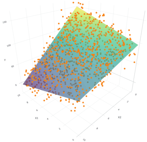
Figure 15: A regression model with both a quadratic term and an interaction term
Regression analysis is a vast field with countless applications across the social sciences. Although it relies on mathematics, a key lesson is that progress comes not from memorising formulas, but from developing a critical grasp of the central ideas: distinguishing correlation from causation, understanding the need to hold other factors constant, and recognising the influence of confounding variables. With that foundation in place, more advanced extensions – such as interactions, nonlinearities, and beyond – become far easier to learn and to use effectively in practice. Just as importantly, this approach turns regression from a purely technical exercise into a way of thinking carefully about data: asking what the numbers really show, questioning when results are meaningful, and recognising when they may mislead. Equipped with this mindset, the technical tools of regression become far more powerful, helping us uncover insights that genuinely deepen our understanding of the world.
References
Agresti, A., Franklin, C. A., and Klingenberg, B. (2021). Statistics: The Art and Science of Learning from Data, 5th ed., Pearson
Freeman, R. B. (1999), “The economics of crime”, Handbook of labor economics, vol. 3, pp. 3529-3571. https://doi.org/10.1016/S1573-4463(99)30043-2
Greene, W. H. (2017). Econometric Analysis, 8th ed., Pearson
Kantzara, V. (2011), “The relation of education to social cohesion”, Social cohesion and Development, vol. 6(1), pp. 37-50. https://doi.org/10.12681/scad.8973
R Core Team, (2023). R: A Language and Environment for Statistical Computing. R Foundation for Statistical Computing, Vienna, Austria.
Sievert, C. (2020). Interactive Web-Based Data Visualization with R, Plotly, and Shiny, Chapman and Hall/CRC Florida.
StataCorp. (2025). Stata Statistical Software: Release 19. College Station, TX: StataCorp LLC.
Stock, J., and Watson, M. (2019). Introduction to Econometrics, Global ed., Pearson Education
Wooldridge, J. M. (2020). Introductory Econometrics: A Modern Approach, 7th ed., Cengage
Notes
- ^ The term regression was first used by Francis Galton to describe how children’s heights tended to “regress toward the mean” of the population. Over time, statisticians broadened the meaning to describe any method that estimates how one variable depends on others, as explained in this short blog post.
- ^ To be precise, the OLS method finds the line that minimizes the sum of the ‘squared distances’ between the line and the data points – what we call the residuals. This is an interesting approach, but explaining this in detail would take us too far from our purpose here.
- ^ The regression line is given by the equation
 = −50.9 + 1.49 Education where the slope coefficient of about 1.5 represents the change in , the predicted crime rate, for a 1 unit change in Education.
 - ^ Because we have fewer data points, the estimated relationship is less precise, meaning that it is harder to draw firm conclusions about the overall population from this sample. For example, if we looked at different years of data, the slope might vary more, and we would be less confident that the relationship is truly negative each time. By contrast, the simulated dataset contains many more observations, so the negative relationship appears much sharper and more reliable. In technical terms, this difference would show up in the size of the standard errors – a measure of how much our estimates would vary if we repeated the analysis with new samples. In practice, the standard errors for the simulated data are about ten times smaller than those for the real-world data!
- ^ The estimated regression ‘plane’ is given by = 59.1 − 0.58 Education + 0.68 Density, where the coefficient of the education variable tells us that, for a given level of density, a 1-percentage-point increase in adults with higher education is associated with about 0.6 fewer crimes per 1,000 residents.